KALO
UX / UI TABLET DESIGN

Project Overview
The Kitchen Assistant & Living Organisation (KALO) is an integrated digital device that elderly home owners can use within their kitchen space to feel more safer, confident and independent. Throughout this project, my team developed a sound understanding through primary and secondary sources of what old generations needed to be able to continue to live in a space they love.
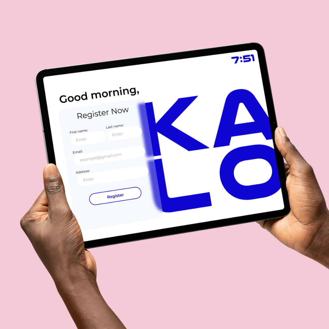
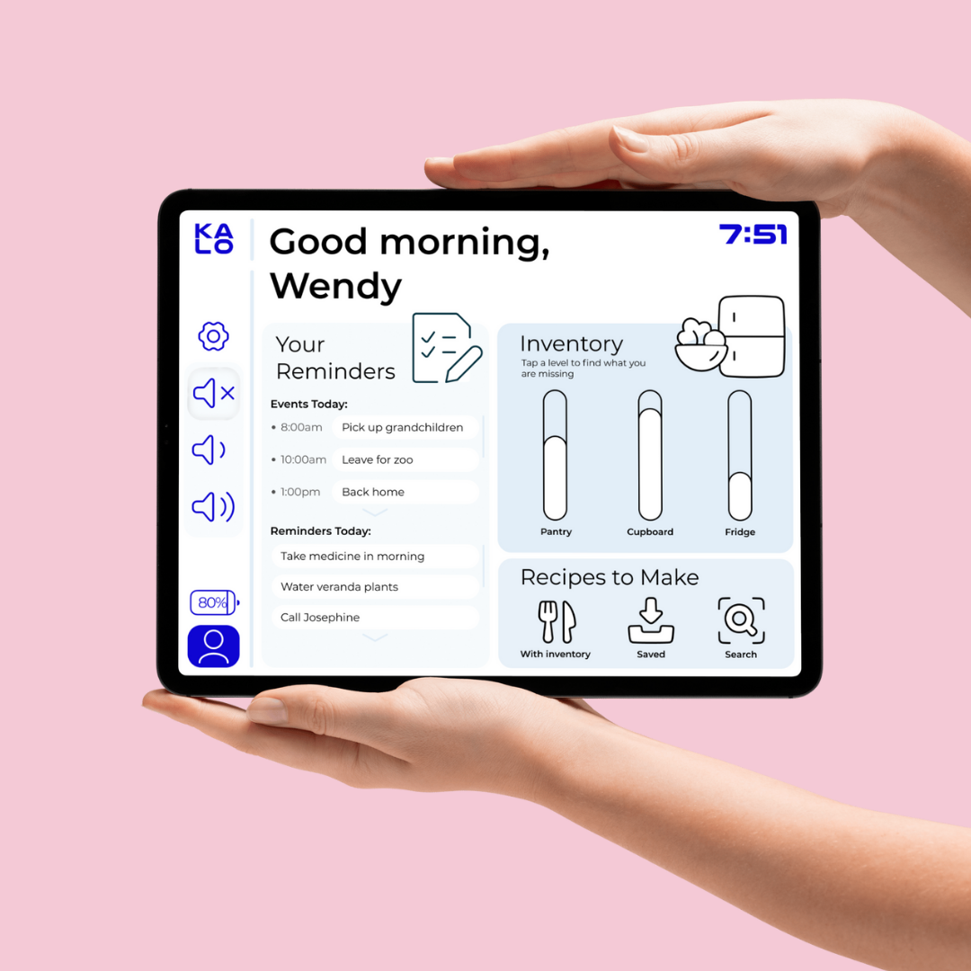
KALO is a magnetic tablet that can attach to the fridge and is thick enough to grip easily without pain and frustration. The interface design consists of a simplified grocery inventory tracker to remind users of expiring foods, ingredients to restock and what recipes to make
Timeframe:
12 Weeks
Roles:
Research, User Testing, & Lead Interface Designer
Tools:
Figma (Design)
Understanding the Problem
There is a clear gap in technology and design that supported elderly people in a care home vs at home, and with many older Australians choosing to stay in their family home for longer than what their health requirements may necessarily present.


Key Objectives
Support the elderly with their food inventory needs, by forming up-to-date shopping lists, available recipes and daily event reminders.
Make the device to integrate seamlessly into their lives.
Feel intuitive to use, which provides technological confidence and willingness to continue using the device.
Visually easy to read, so large text, big buttons and simple navigation.
Design Process
From researching secondary sources to uncovering key user feedback from interviews and observations, as Lead Interface Designer, I executed a high-fidelity Figma prototype of KALO. The interface consists of clean, simplified design, with a crisp blue monotone look.
Quick Overview:

My team conducted each multiple users tests through one on one observations, interviews, and surveys to understand what living conditions are like. Furthermore, recognise what health conditions our users have to battle with every day, such as arthritis, low vision, poor cognitive function, and/or mobility issues. These became major factors in making sure our design (physically and digitally) would be appropriate and accessible to everyone. So, from communicating with our clients, we unpacked all the temporary solutions that they have to “manage” their kitchen related issues. In essence, it became clear to us that we didn’t want to provide a band-aid solution but rather solve the issue so future users feel like they are being taken care of (from the comfort of their own homes).
Fulling User Needs:
As we constructed our design brief, we noticed that not only can KALO be helpful to those in need but can also be integrated into everyone’s lives. Because who doesn’t want to have a constant up-to-date shopping list, or a personalised list of recipes to make from what you already have? We uncovered that KALO wouldn’t just help out in the kitchen but also benefit financially (saving food from waste and cooking new recipes without having to shop prior), and improve productivity (organised shopping lists).
In order to get older Australians to implement the device into their everyday living, the design needs to be simple to use and cost effective. We came up with an initial design that follows very simple functions with big buttons and a bold/deep colour palette. However, the digital design also needed to be aesthetically pleasing since it would be displayed in the home. So we opted for a neutral colour palette but still applied the same large buttons and functions.
Solutions:
Therefore, design-wise I went for:
Clean blue, black and white monotone colour palette. This way the interface is clear to read, with no distractions and can highlight to users specialised functions.
Simple outline visuals so users can recognise functions faster and is more legible to users who have low vision and can not read text quickly.
Simple operations and flow so users to feel confident when using the device.