Developing SkinSolv started with understanding their ethics and motives of the skincare brand, which being innovative, eco-friendly and luxury. All elements that needed to be conveyed through the brandmark yet appeal to a diverse demographic by feeling inclusive and accessible. Hence why the brand identity is represented by a soft blue-grey to appeal to a unisex audience, combined with a gentle typeface that resembles a subtle message of sophistication, and lastly paired with an organic-shaped figuremark to highlight the uniqueness of your skin and the Earth.


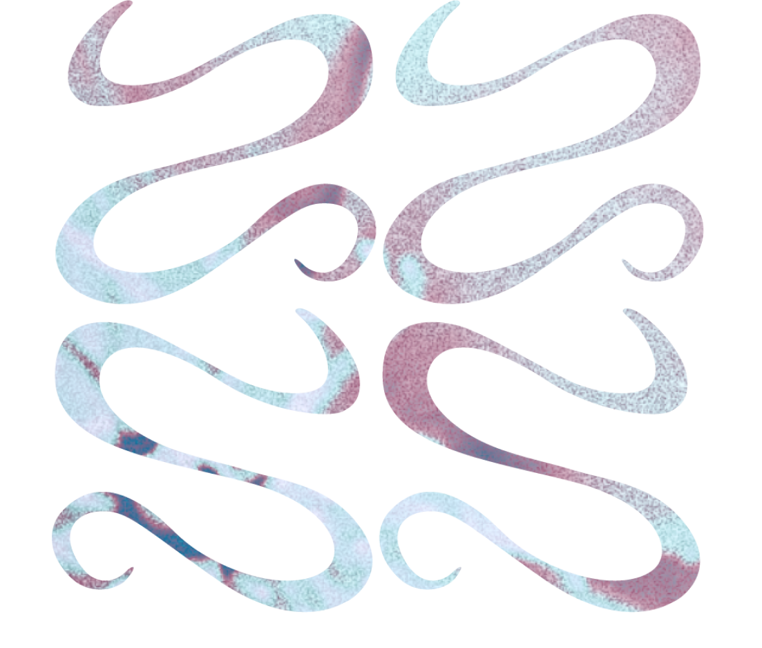
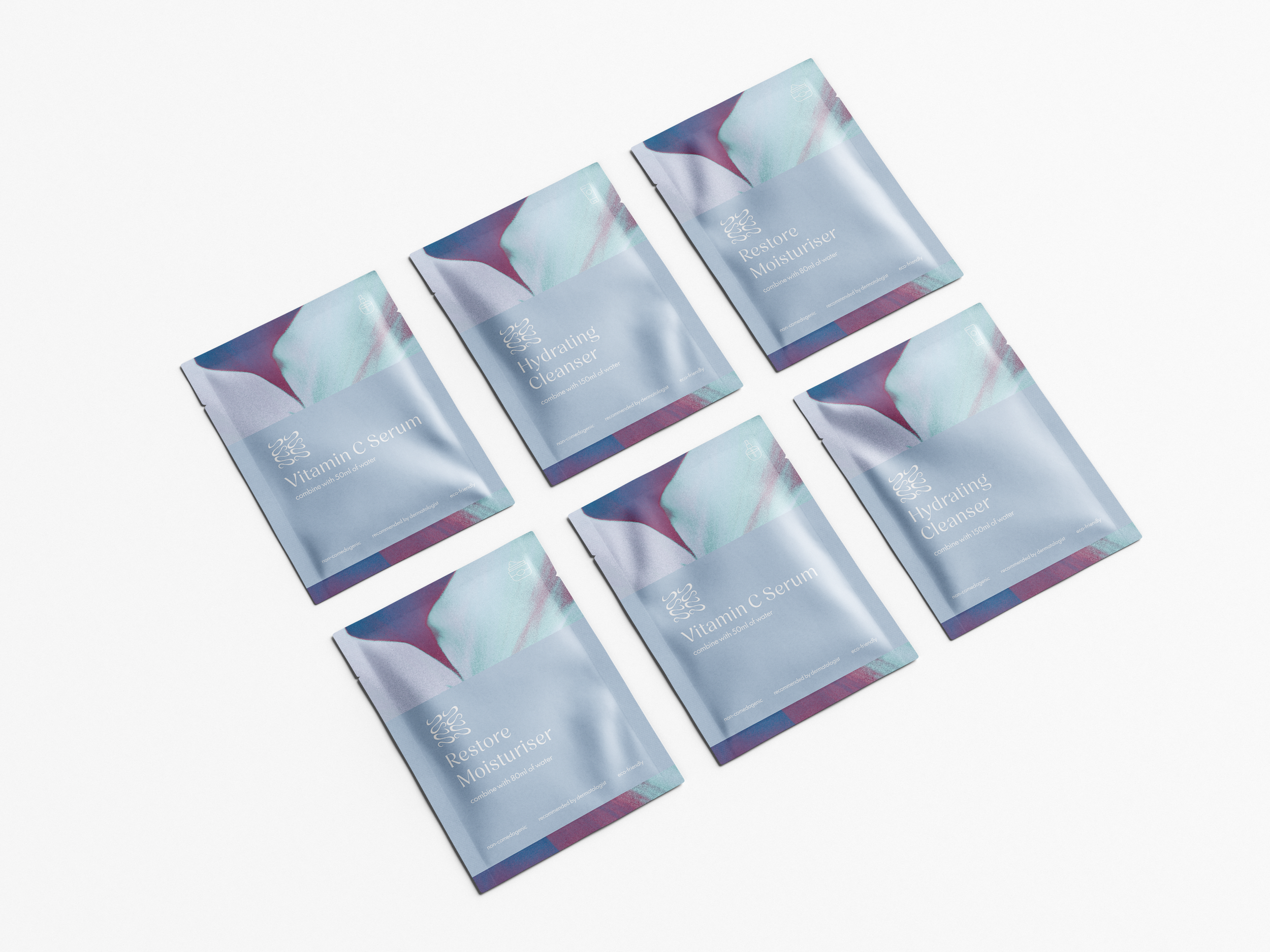
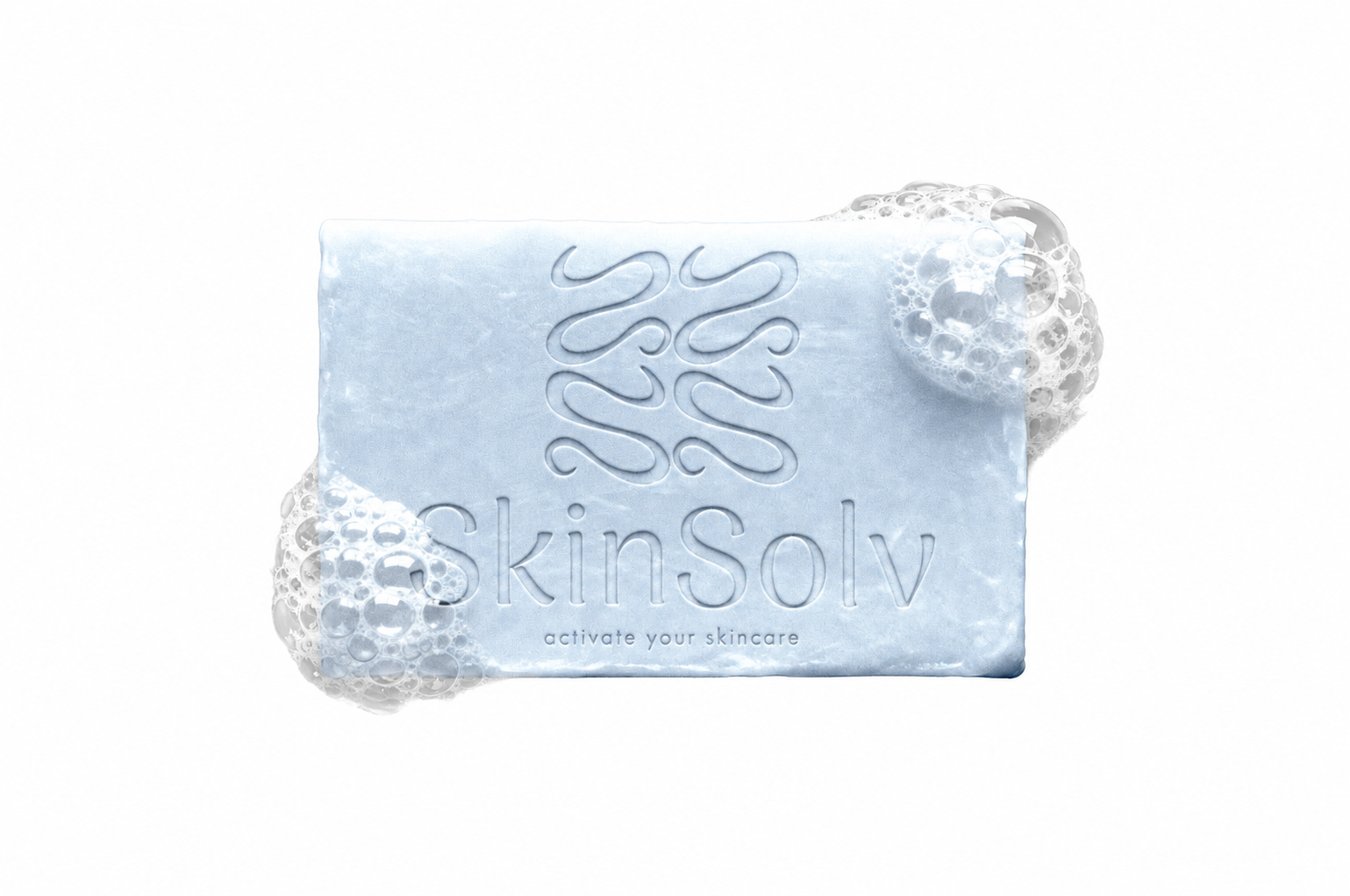
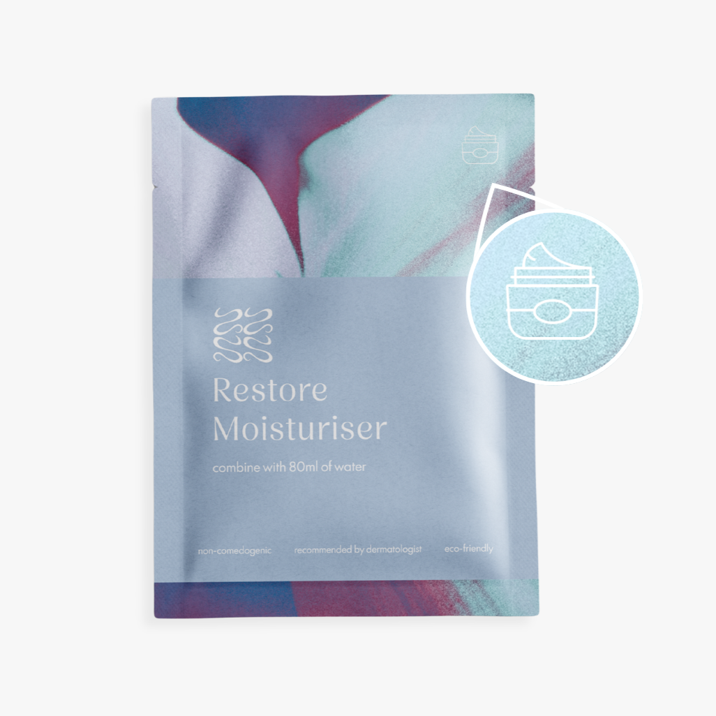
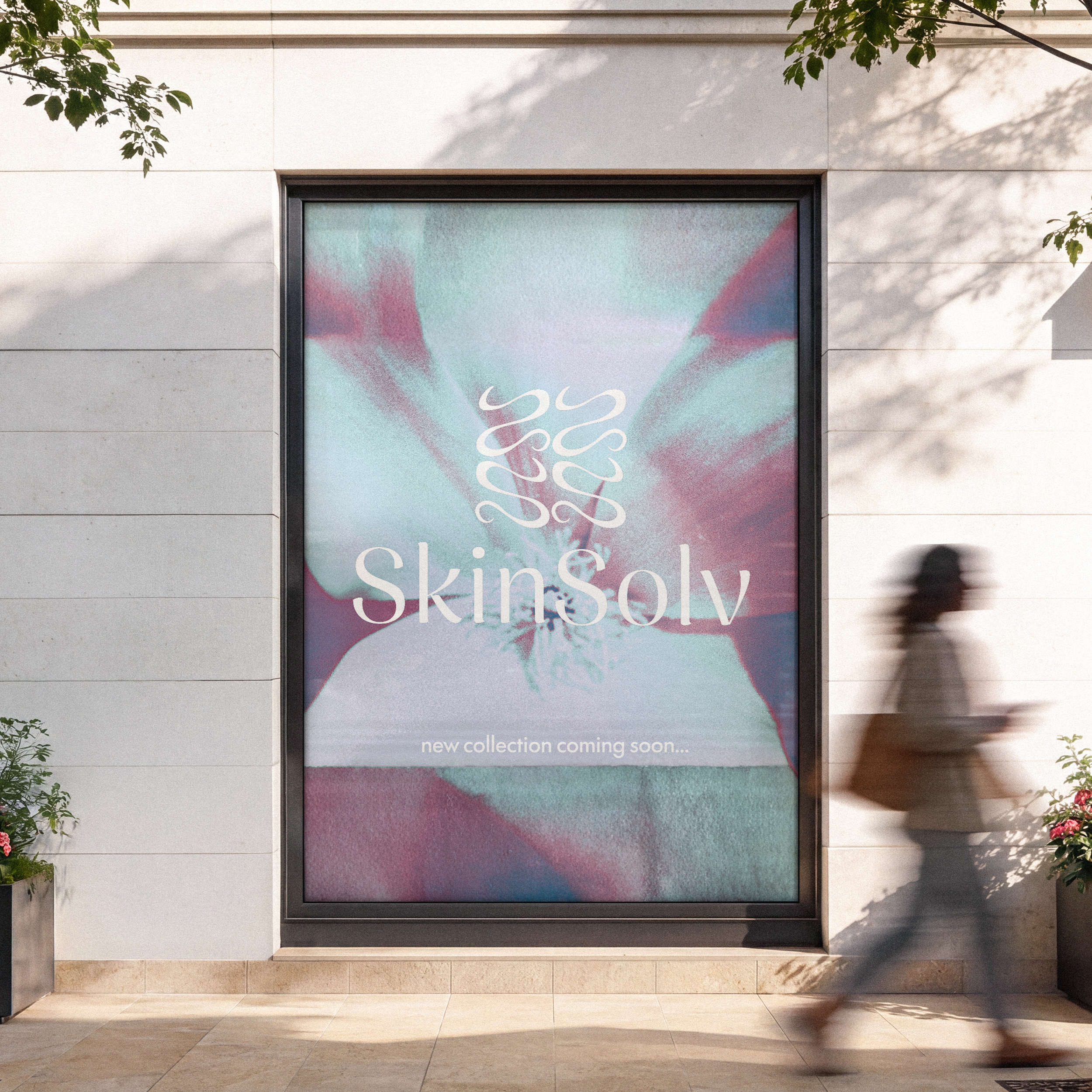
To further develop SkinSolv’s brand identity, the use of their signature cyanotype flower print combined with bold imagery creates a lasting impression of subtle luxury. With applications produced across physical and digital products that capture your attention in a sense of being understated but recognisable in its signature design.
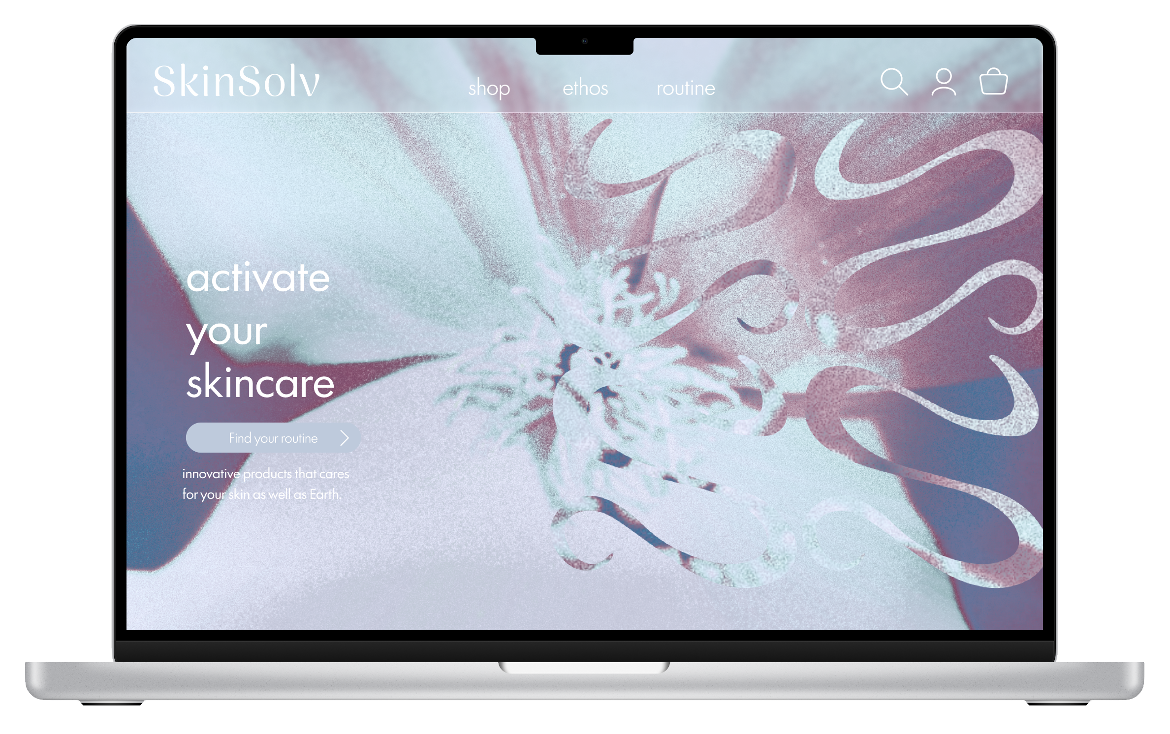
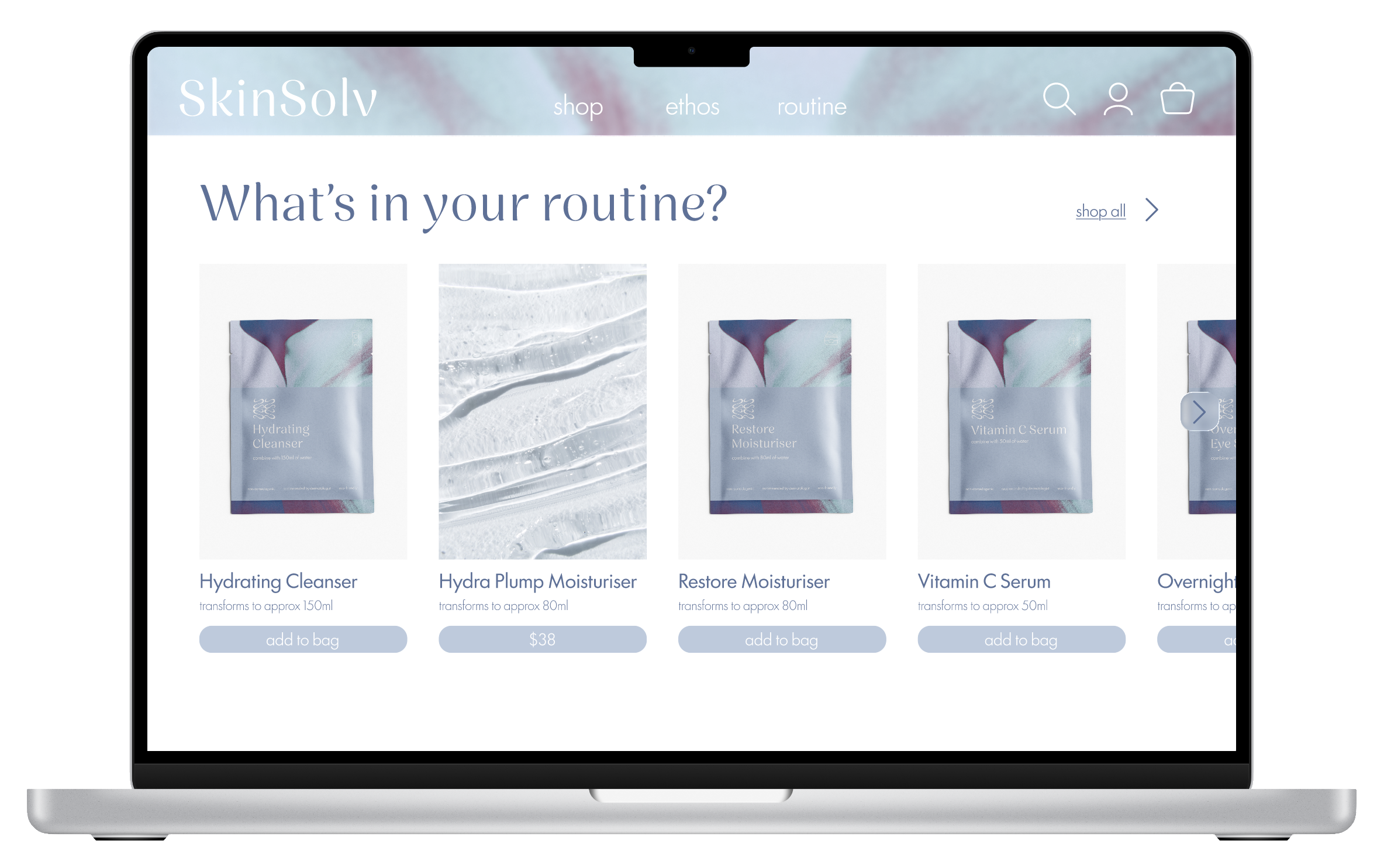
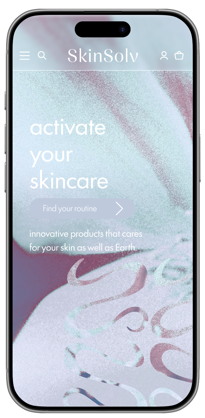
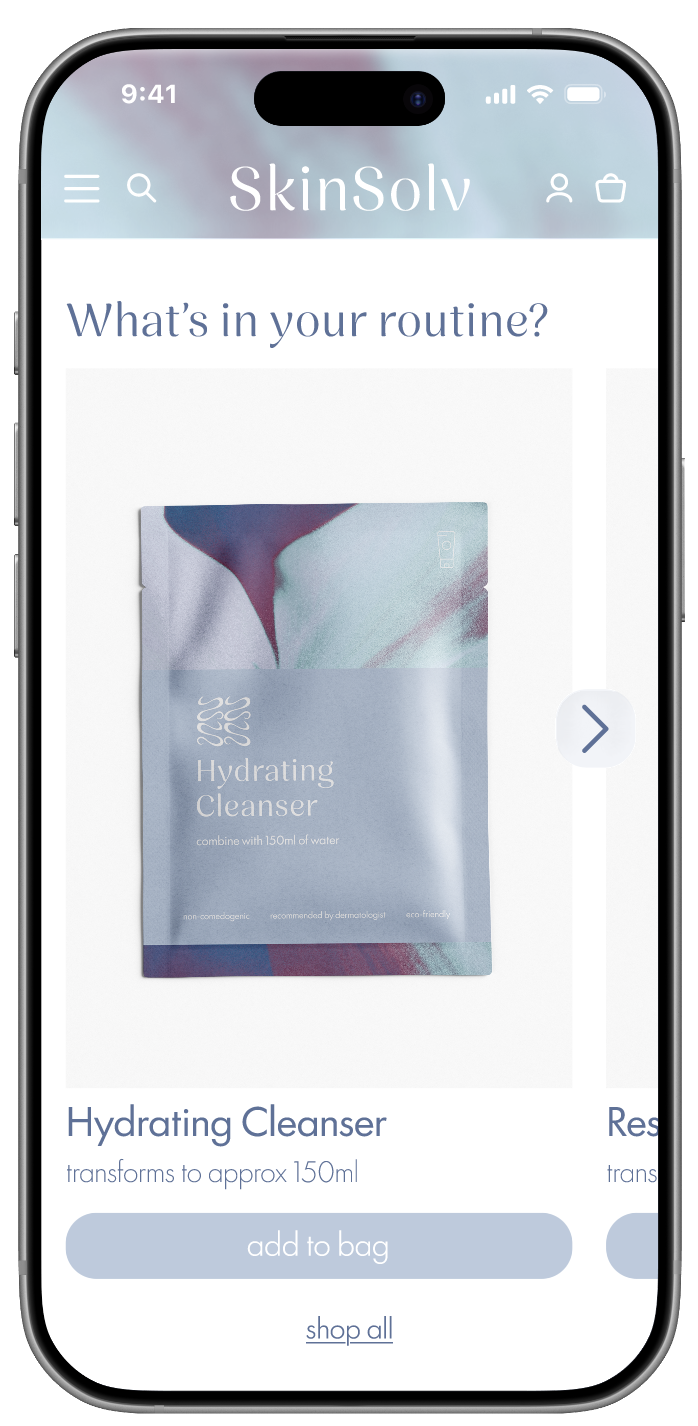
SkinSolv’s signature look also had to be adapted to digital user interface such as a website. So to carry on SkinSolv’s unique bold values, the design of the website utilises their secondary branding to create a striking editorial feel, that shows off their innovation and competitor differences.